多行文本輸入區域。 更多...
| import 語句: |
import QtQuick.Controls
|
| 繼承: |
(since QtQuick.Controls 2.5 (Qt 5.12))
(since QtQuick.Controls 2.1 (Qt 5.8))
(since QtQuick.Controls 2.1 (Qt 5.8))
(since QtQuick.Controls 2.5 (Qt 5.12))
(since QtQuick.Controls 2.5 (Qt 5.12))
(since QtQuick.Controls 2.5 (Qt 5.12))
(since QtQuick.Controls 2.5 (Qt 5.12))
(since QtQuick.Controls 2.5 (Qt 5.12))
(since QtQuick.Controls 2.5 (Qt 5.12))
(since QtQuick.Controls 2.1 (Qt 5.8))
(since QtQuick.Controls 2.1 (Qt 5.8))
TextArea 是多行文本編輯器。TextArea 擴展 TextEdit 采用 占位符文本 功能,並添加裝飾。

TextArea {
    placeholderText: qsTr("Enter description")
}
TextArea is not scrollable by itself. Especially on screen-size constrained platforms, it is often preferable to make entire application pages scrollable. On such a scrollable page, a non-scrollable TextArea might behave better than nested scrollable controls. Notice, however, that in such a scenario, the background decoration of the TextArea scrolls together with the rest of the scrollable content.
If you want to make a TextArea scrollable, for example, when it covers an entire application page, it can be placed inside a ScrollView .
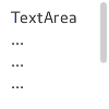
ScrollView {
    id: view
    anchors.fill: parent
    TextArea {
        text: "TextArea\n...\n...\n...\n...\n...\n...\n"
    }
}
A TextArea that is placed inside a ScrollView does the following:
By default, pressing the tab key while TextArea has active focus results in a tab character being input into the control itself. To make tab pass active focus onto another item, use the attached KeyNavigation 特性:
TextField {
    id: textField
}
TextArea {
    KeyNavigation.priority: KeyNavigation.BeforeItem
    KeyNavigation.tab: textField
}
另請參閱 TextField , 定製 TextArea ,和 輸入控件 .
|
background : Item |
此特性保持背景項。
注意: If the background item has no explicit size specified, it automatically follows the control's size. In most cases, there is no need to specify width or height for a background item.
注意: Most controls use the implicit size of the background item to calculate the implicit size of the control itself. If you replace the background item with a custom one, you should also consider providing a sensible implicit size for it (unless it is an item like 圖像 which has its own implicit size).
另請參閱 定製 TextArea .
|
bottomInset
:
real
|
This property holds the bottom inset for the background.
該特性在 QtQuick.Controls 2.5 (Qt 5.12) 引入。
另請參閱 Control Layout and topInset .
|
focusReason : enumeration |
此特性保持最後聚焦更改的原因。
注意: This property does not indicate whether the item has active focus , but the reason why the item either gained or lost focus.
| 常量 | 描述 |
|---|---|
Qt.MouseFocusReason
|
齣現鼠標動作。 |
Qt.TabFocusReason
|
按下 Tab 鍵。 |
Qt.BacktabFocusReason
|
發生 Backtab。輸入可能包括 Shift 或 Control 鍵;如 Shift+Tab。 |
Qt.ActiveWindowFocusReason
|
窗口係統使此窗口活動 (或不活動)。 |
Qt.PopupFocusReason
|
應用程序打開/關閉彈齣窗口,抓取/釋放鍵盤焦點。 |
Qt.ShortcutFocusReason
|
用戶鍵入標簽的好友快捷方式 |
Qt.MenuBarFocusReason
|
菜單欄獲得聚焦。 |
Qt.OtherFocusReason
|
另一原因,通常特定於應用程序。 |
注意: Prefer QtQuick.Controls::Control::focusReason to this property.
|
hoverEnabled
:
bool
|
This property determines whether the text area accepts hover events. The default value is
true
.
該特性在 QtQuick.Controls 2.1 (Qt 5.8) 引入。
另請參閱 hovered .
|
hovered
:
bool
|
This property holds whether the text area is hovered.
該特性在 QtQuick.Controls 2.1 (Qt 5.8) 引入。
另請參閱 hoverEnabled .
|
implicitBackgroundHeight
:
real
|
This property holds the implicit background height.
值等於
background ? background.implicitHeight : 0
.
該特性在 QtQuick.Controls 2.5 (Qt 5.12) 引入。
另請參閱 implicitBackgroundWidth .
|
implicitBackgroundWidth
:
real
|
This property holds the implicit background width.
值等於
background ? background.implicitWidth : 0
.
該特性在 QtQuick.Controls 2.5 (Qt 5.12) 引入。
另請參閱 implicitBackgroundHeight .
|
leftInset
:
real
|
This property holds the left inset for the background.
該特性在 QtQuick.Controls 2.5 (Qt 5.12) 引入。
另請參閱 Control Layout and rightInset .
|
placeholderText : string |
This property holds the short hint that is displayed in the text area before the user enters a value.
|
placeholderTextColor
:
color
|
This property holds the color of placeholderText .
該特性在 QtQuick.Controls 2.5 (Qt 5.12) 引入。
另請參閱 placeholderText .
|
rightInset
:
real
|
This property holds the right inset for the background.
該特性在 QtQuick.Controls 2.5 (Qt 5.12) 引入。
另請參閱 Control Layout and leftInset .
|
topInset
:
real
|
This property holds the top inset for the background.
該特性在 QtQuick.Controls 2.5 (Qt 5.12) 引入。
另請參閱 Control Layout and bottomInset .
|
TextArea.flickable : TextArea |
This property attaches a text area to a Flickable .
另請參閱 ScrollBar , ScrollIndicator ,和 可捲動 TextArea .
|
pressAndHold ( MouseEvent event ) |
This signal is emitted when there is a long press (the delay depends on the platform plugin). The event parameter provides information about the press, including the x and y coordinates of the press, and which button is pressed.
注意:
相應處理程序是
onPressAndHold
.
|
|
This signal is emitted when the text area is pressed by the user. The event parameter provides information about the press, including the x and y coordinates of the press, and which button is pressed.
注意:
相應處理程序是
onPressed
.
該信號在 QtQuick.Controls 2.1 (Qt 5.8) 引入。
另請參閱 released and pressAndHold .
|
|
This signal is emitted when the text area is released by the user. The event parameter provides information about the release, including the x and y coordinates of the press, and which button is pressed.
注意:
相應處理程序是
onReleased
.
該信號在 QtQuick.Controls 2.1 (Qt 5.8) 引入。
另請參閱 pressed and pressAndHold .