Abstract base type providing functionality common to all controls. 更多...
| import 語句: |
import QtQuick.Controls
|
| 繼承: | |
| 繼承者: |
21 typesAbstractButton , BusyIndicator , ComboBox , Container , DayOfWeekRow , Dial , MenuSeparator , MonthGrid , PageIndicator , Pane , ProgressBar , RangeSlider , ScrollBar , ScrollIndicator , SelectionRectangle , Slider , SpinBox , StackView , ToolSeparator , Tumbler ,和 WeekNumberColumn |
(since QtQuick.Controls 2.5 (Qt 5.12))
(since QtQuick.Controls 2.5 (Qt 5.12))
(since QtQuick.Controls 2.5 (Qt 5.12))
(since QtQuick.Controls 2.5 (Qt 5.12))
(since QtQuick.Controls 2.5 (Qt 5.12))
(since QtQuick.Controls 2.5 (Qt 5.12))
(since QtQuick.Controls 2.5 (Qt 5.12))
(since QtQuick.Controls 2.5 (Qt 5.12))
(since QtQuick.Controls 2.5 (Qt 5.12))
(since QtQuick.Controls 2.5 (Qt 5.12))
Control is the base type of user interface controls. It receives input events from the window system, and paints a representation of itself on the screen.
The following diagram illustrates the layout of a typical control:
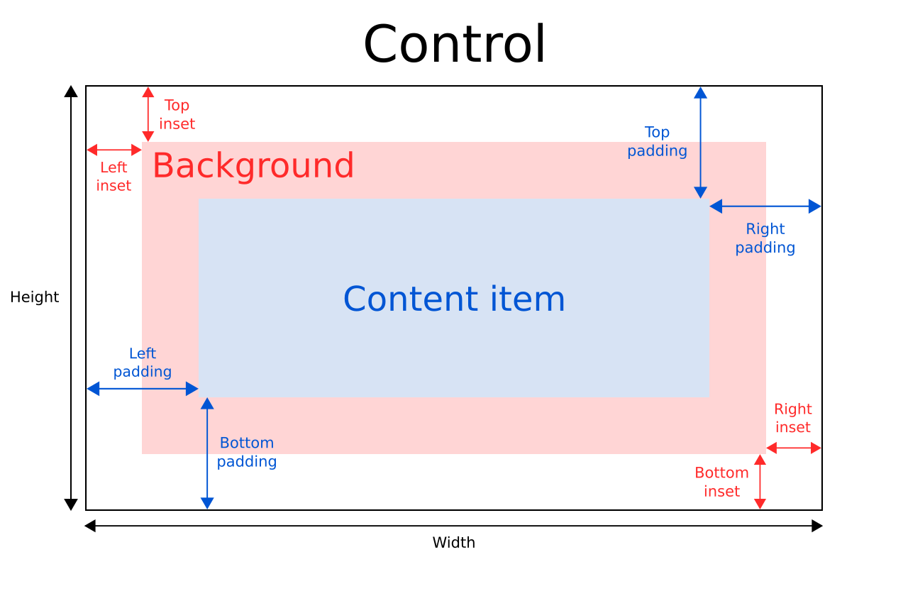
The implicitWidth and implicitHeight of a control are typically based on the implicit sizes of the background and the content item plus any insets and paddings. These properties determine how large the control will be when no explicit width or height 被指定。
The geometry of the contentItem is determined by the padding. The following example reserves 10px padding between the boundaries of the control and its content:
Control {
    padding: 10
    contentItem: Text {
        text: "Content"
    }
}
The background item fills the entire width and height of the control, unless insets or an explicit size have been given for it. Background insets are useful for extending the touchable/interactive area of a control without affecting its visual size. This is often used on touch devices to ensure that a control is not too small to be interacted with by the user. Insets affect the size of the control, and hence will affect how much space they take up in a layout, for example.
Negative insets can be used to make the background larger than the control. The following example uses negative insets to place a shadow outside the control's boundaries:
Control {
    topInset: -2
    leftInset: -2
    rightInset: -6
    bottomInset: -6
    background: BorderImage {
        source: ":/images/shadowed-background.png"
    }
}
All controls, except non-interactive indicators, do not let clicks and touches through to items below them. For example, the
console.log()
call in the example below will never be executed when clicking on the Pane, because the
MouseArea
is below it in the scene:
MouseArea {
    anchors.fill: parent
    onClicked: console.log("MouseArea was clicked")
    Pane {
        anchors.fill: parent
    }
}
Wheel events are consumed by controls if
wheelEnabled
is
true
.
另請參閱 ApplicationWindow , Container ,和 Using Qt Quick Controls types in property declarations .
|
availableHeight
:
real
|
This property holds the height available to the contentItem after deducting vertical padding from the height of the control.
另請參閱 Control Layout , padding , topPadding ,和 bottomPadding .
|
availableWidth
:
real
|
This property holds the width available to the contentItem after deducting horizontal padding from the width of the control.
另請參閱 Control Layout , padding , leftPadding ,和 rightPadding .
|
background : Item |
此特性保持背景項。
Button {
    id: control
    text: qsTr("Button")
    background: Rectangle {
        implicitWidth: 100
        implicitHeight: 40
        opacity: enabled ? 1 : 0.3
        color: control.down ? "#d0d0d0" : "#e0e0e0"
    }
}
注意: If the background item has no explicit size specified, it automatically follows the control's size. In most cases, there is no need to specify width or height for a background item.
注意: Most controls use the implicit size of the background item to calculate the implicit size of the control itself. If you replace the background item with a custom one, you should also consider providing a sensible implicit size for it (unless it is an item like 圖像 which has its own implicit size).
另請參閱 Control Layout .
|
bottomInset
:
real
|
This property holds the bottom inset for the background.
該特性在 QtQuick.Controls 2.5 (Qt 5.12) 引入。
另請參閱 Control Layout and topInset .
|
bottomPadding : real |
This property holds the bottom padding. Unless explicitly set, the value is equal to
verticalPadding
.
另請參閱 Control Layout , padding , topPadding , verticalPadding ,和 availableHeight .
|
contentItem : Item |
This property holds the visual content item.
Button {
    id: control
    text: qsTr("Button")
    contentItem: Label {
        text: control.text
        verticalAlignment: Text.AlignVCenter
    }
}
注意: The content item is automatically positioned and resized to fit within the padding of the control. Bindings to the x , y , width ,和 height properties of the contentItem are not respected.
注意: Most controls use the implicit size of the content item to calculate the implicit size of the control itself. If you replace the content item with a custom one, you should also consider providing a sensible implicit size for it (unless it is an item like 文本 which has its own implicit size).
另請參閱 Control Layout and padding .
|
focusReason : enumeration |
此特性保持最後聚焦更改的原因。
The value of this property is modified by Qt whenever focus is transferred, and you should never have to set this property yourself.
注意: This property does not indicate whether the item has active focus , but the reason why the item either gained or lost focus.
| 常量 | 描述 |
|---|---|
Qt.MouseFocusReason
|
齣現鼠標動作。 |
Qt.TabFocusReason
|
按下 Tab 鍵。 |
Qt.BacktabFocusReason
|
發生 Backtab。輸入可能包括 Shift 或 Control 鍵;如 Shift+Tab。 |
Qt.ActiveWindowFocusReason
|
窗口係統使此窗口活動 (或不活動)。 |
Qt.PopupFocusReason
|
應用程序打開/關閉彈齣窗口,抓取/釋放鍵盤焦點。 |
Qt.ShortcutFocusReason
|
用戶鍵入標簽的好友快捷方式 |
Qt.MenuBarFocusReason
|
菜單欄獲得聚焦。 |
Qt.OtherFocusReason
|
另一原因,通常特定於應用程序。 |
另請參閱 Item::activeFocus and visualFocus .
|
font : font |
This property holds the font currently set for the control.
This property describes the control's requested font. The font is used by the control's style when rendering standard components, and is available as a means to ensure that custom controls can maintain consistency with the native platform's native look and feel. It's common that different platforms, or different styles, define different fonts for an application.
The default font depends on the system environment. ApplicationWindow maintains a system/theme font which serves as a default for all controls. There may also be special font defaults for certain types of controls. You can also set the default font for controls by either:
Finally, the font is matched against Qt's font database to find the best match.
Control propagates explicit font properties from parent to children. If you change a specific property on a control's font, that property propagates to all of the control's children, overriding any system defaults for that property.
Page {
    font.family: "Courier"
    Column {
        Label {
            text: qsTr("This will use Courier...")
        }
        Switch {
            text: qsTr("... and so will this")
        }
    }
}
For the full list of available font properties, see the font QML Value Type 文檔編製。
|
horizontalPadding
:
real
|
This property holds the horizontal padding. Unless explicitly set, the value is equal to
padding
.
該特性在 QtQuick.Controls 2.5 (Qt 5.12) 引入。
另請參閱 Control Layout , padding , leftPadding , rightPadding ,和 verticalPadding .
|
hoverEnabled : bool |
This property determines whether the control accepts hover events. The default value is
Application.styleHints.useHoverEffects
.
Setting this property propagates the value to all child controls that do not have
hoverEnabled
explicitly set.
You can also enable or disable hover effects for all Qt Quick Controls applications by setting the
QT_QUICK_CONTROLS_HOVER_ENABLED
環境變量
.
另請參閱 hovered .
|
hovered
:
bool
|
This property holds whether the control is hovered.
另請參閱 hoverEnabled .
|
implicitBackgroundHeight
:
real
|
This property holds the implicit background height.
值等於
background ? background.implicitHeight : 0
.
This is typically used, together with implicitContentHeight , to calculate the implicitHeight :
Control {
    implicitHeight: Math.max(implicitBackgroundHeight + topInset + bottomInset,
                             implicitContentHeight + topPadding + bottomPadding)
}
該特性在 QtQuick.Controls 2.5 (Qt 5.12) 引入。
另請參閱 implicitBackgroundWidth and implicitContentHeight .
|
implicitBackgroundWidth
:
real
|
This property holds the implicit background width.
值等於
background ? background.implicitWidth : 0
.
This is typically used, together with implicitContentWidth , to calculate the implicitWidth :
Control {
    implicitWidth: Math.max(implicitBackgroundWidth + leftInset + rightInset,
                            implicitContentWidth + leftPadding + rightPadding)
}
該特性在 QtQuick.Controls 2.5 (Qt 5.12) 引入。
另請參閱 implicitBackgroundHeight and implicitContentWidth .
|
implicitContentHeight
:
real
|
This property holds the implicit content height.
For basic controls, the value is equal to
contentItem ? contentItem.implicitHeight : 0
. For types that inherit Container or Pane, the value is calculated based on the content children.
This is typically used, together with implicitBackgroundHeight , to calculate the implicitHeight :
Control {
    implicitHeight: Math.max(implicitBackgroundHeight + topInset + bottomInset,
                             implicitContentHeight + topPadding + bottomPadding)
}
該特性在 QtQuick.Controls 2.5 (Qt 5.12) 引入。
另請參閱 implicitContentWidth and implicitBackgroundHeight .
|
implicitContentWidth
:
real
|
This property holds the implicit content width.
For basic controls, the value is equal to
contentItem ? contentItem.implicitWidth : 0
. For types that inherit Container or Pane, the value is calculated based on the content children.
This is typically used, together with implicitBackgroundWidth , to calculate the implicitWidth :
Control {
    implicitWidth: Math.max(implicitBackgroundWidth + leftInset + rightInset,
                            implicitContentWidth + leftPadding + rightPadding)
}
該特性在 QtQuick.Controls 2.5 (Qt 5.12) 引入。
另請參閱 implicitContentHeight and implicitBackgroundWidth .
|
leftInset
:
real
|
This property holds the left inset for the background.
該特性在 QtQuick.Controls 2.5 (Qt 5.12) 引入。
另請參閱 Control Layout and rightInset .
|
leftPadding : real |
This property holds the left padding. Unless explicitly set, the value is equal to
horizontalPadding
.
另請參閱 Control Layout , padding , rightPadding , horizontalPadding ,和 availableWidth .
|
locale : Locale |
This property holds the locale of the control.
It contains locale specific properties for formatting data and numbers. Unless a special locale has been set, this is either the parent's locale or the default locale.
Control propagates the locale from parent to children. If you change the control's locale, that locale propagates to all of the control's children, overriding the system default locale.
另請參閱 mirrored .
|
mirrored
:
bool
|
This property holds whether the control is mirrored.
This property is provided for convenience. A control is considered mirrored when its visual layout direction is right-to-left; that is, when
LayoutMirroring.enabled
is
true
.
As of Qt 6.2, the locale property no longer affects this property.
另請參閱 LayoutMirroring and 從右到左的用戶界麵 .
|
padding : real |
This property holds the default padding.
Padding adds a space between each edge of the content item and the background item, effectively controlling the size of the content item. To specify a padding value for a specific edge of the control, set its relevant property:
注意: Different styles may specify the default padding for certain controls in different ways, and these ways may change over time as the design guidelines that the style is based on evolve. To ensure that these changes don't affect the padding values you have specified, it is best to use the most specific properties available. For example, rather than setting the padding property:
padding: 0
set each specific property instead:
leftPadding: 0
rightPadding: 0
topPadding: 0
bottomPadding: 0
另請參閱 Control Layout , availableWidth , availableHeight , topPadding , leftPadding , rightPadding ,和 bottomPadding .
|
rightInset
:
real
|
This property holds the right inset for the background.
該特性在 QtQuick.Controls 2.5 (Qt 5.12) 引入。
另請參閱 Control Layout and leftInset .
|
rightPadding : real |
This property holds the right padding. Unless explicitly set, the value is equal to
horizontalPadding
.
另請參閱 Control Layout , padding , leftPadding , horizontalPadding ,和 availableWidth .
|
spacing : real |
This property holds the spacing.
Spacing is useful for controls that have multiple or repetitive building blocks. For example, some styles use spacing to determine the distance between the text and indicator of CheckBox . Spacing is not enforced by Control, so each style may interpret it differently, and some may ignore it altogether.
|
topInset
:
real
|
This property holds the top inset for the background.
該特性在 QtQuick.Controls 2.5 (Qt 5.12) 引入。
另請參閱 Control Layout and bottomInset .
|
topPadding : real |
This property holds the top padding. Unless explicitly set, the value is equal to
verticalPadding
.
另請參閱 Control Layout , padding , bottomPadding , verticalPadding ,和 availableHeight .
|
verticalPadding
:
real
|
This property holds the vertical padding. Unless explicitly set, the value is equal to
padding
.
該特性在 QtQuick.Controls 2.5 (Qt 5.12) 引入。
另請參閱 Control Layout , padding , topPadding , bottomPadding ,和 horizontalPadding .
|
visualFocus
:
bool
|
This property holds whether the control has visual focus. This property is
true
when the control has active focus and the focus reason is either
Qt.TabFocusReason
,
Qt.BacktabFocusReason
,或
Qt.ShortcutFocusReason
.
In general, for visualizing key focus, this property is preferred over Item::activeFocus . This ensures that key focus is only visualized when interacting with keys - not when interacting via touch or mouse.
另請參閱 focusReason and Item::activeFocus .
|
wheelEnabled : bool |
This property determines whether the control handles wheel events. The default value is
false
.
注意: Care must be taken when enabling wheel events for controls within scrollable items such as Flickable , as the control will consume the events and hence interrupt scrolling of the Flickable.