Used to select table cells inside a TableView . 更多...
| import 語句: |
import QtQuick.Controls
|
| Since: | Qt 6.2 |
| 繼承: |
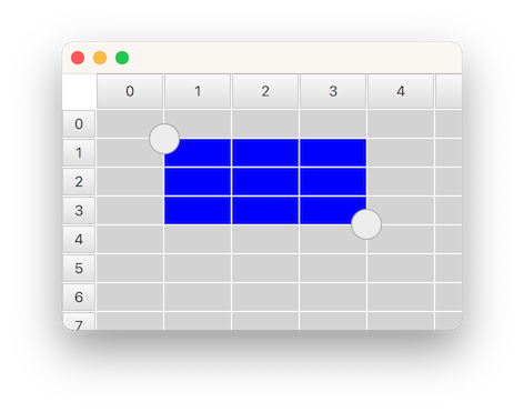
SelectionRectangle is used for selecting table cells in a TableView . It lets the user start a selection by doing a pointer drag inside the viewport, or by doing a long press on top of a cell.
For a SelectionRectangle to be able to select cells, TableView must have an ItemSelectionModel assigned. The ItemSelectionModel will store any selections done on the model, and can be used for querying which cells that the user has selected.
The following example shows how you can make a SelectionRectangle target a TableView :
    TableView {
        id: tableView
        anchors.fill: parent
        clip: true
        model: TableModel {
            TableModelColumn { display: "name" }
            rows: [ { "name": "Harry" }, { "name": "Hedwig" } ]
        }
        selectionModel: ItemSelectionModel {
            model: tableView.model
        }
        delegate: Rectangle {
            implicitWidth: 100
            implicitHeight: 30
            color: selected ? "blue" : "lightgray"
            required property bool selected
            Text { text: display }
        }
    }
    SelectionRectangle {
        target: tableView
    }
注意: A SelectionRectangle itself is not shown as part of a selection. Only the delegates (like topLeftHandle and bottomRightHandle ) are used. You should also consider rendering the TableView delegate as selected .
另請參閱 TableView , TableView::selectionModel ,和 ItemSelectionModel .
|
active
:
bool
|
此特性是
true
while the user is performing a selection. The selection will be active from the time the the user starts to select, and until the selection is removed again, for example from tapping inside the viewport.
|
bottomRightHandle : Component |
This property holds the delegate that will be shown on the center of the top-left corner of the selection rectangle. When a handle is provided, the user can drag it to adjust the selection.
The handle is not hidden by default when a selection is removed. Instead, this is the responsibility of the delegate, to open up for custom fade-out animations. The easiest way to ensure that the handle ends up hidden, is to simply bind visible 到 active state of the SelectionRectangle :
SelectionRectangle {
    bottomRightHandle: Rectangle {
        width: 20
        height: 20
        visible: SelectionRectangle.control.active
    }
}
把此特性設為
null
if you don't want a selection handle on the bottom-right.
另請參閱 topLeftHandle .
|
dragging
:
bool
|
此特性是
true
whenever the user is doing a pointer drag or a handle drag to adjust the selection rectangle.
|
selectionMode : enumeration |
This property holds when a selection should start.
| 常量 | 描述 |
|---|---|
SelectionRectangle.Drag
|
A selection will start by doing a pointer drag inside the viewport |
SelectionRectangle.PressAndHold
|
A selection will start by doing a press and hold on top a cell |
SelectionRectangle.Auto
|
SelectionRectangle
will choose which mode to use based on the target and the platform. This normally means
PressAndHold
on touch based platforms, and
Drag
on desktop. However,
Drag
will only be used if it doesn't conflict with flicking. This means that
TableView
will need to be configured with
interactive
設為
false
, or placed inside a
ScrollView
(where flicking, by default, is off for mouse events), for
Drag
to be chosen.
|
默認值為
Auto
.
|
target : Item |
此特性保持 TableView on which the SelectionRectangle should act.
|
topLeftHandle : Component |
This property holds the delegate that will be shown on the center of the top-left corner of the selection rectangle. When a handle is provided, the user can drag it to adjust the selection.
The handle is not hidden by default when a selection is removed. Instead, this is the responsibility of the delegate, to open up for custom fade-out animations. The easiest way to ensure that the handle ends up hidden, is to simply bind visible 到 active state of the SelectionRectangle :
SelectionRectangle {
    topLeftHandle: Rectangle {
        width: 20
        height: 20
        visible: SelectionRectangle.control.active
    }
}
把此特性設為
null
if you don't want a selection handle on the top-left.
另請參閱 bottomRightHandle .
|
SelectionRectangle.control : SelectionRectangle |
This attached property holds the SelectionRectangle that manages the delegate instance. It is attached to each handle instance.
|
SelectionRectangle.dragging : bool |
This attached property will be
true
if the user is dragging on the handle. It is attached to each handle instance.