描繪帶有可選邊框的填充矩形。 更多...
| import 語句: |
import QtQuick
|
| 繼承: |
(從 6.7 起)
(從 6.7 起)
(從 6.7 起)
(從 6.7 起)
矩形項用於以純色 (或漸變) 填充區域,和/或提供矩形邊框。
Each Rectangle item is painted using either a solid fill color, specified using the color property, or a gradient, defined using a Gradient type and set using the gradient property. If both a color and a gradient are specified, the gradient is used.
You can add an optional border to a rectangle with its own color and thickness by setting the border.color and border.width properties. Set the color to "transparent" to paint a border without a fill color.
還可以創建圓角矩形使用 radius property. Since this introduces curved edges to the corners of a rectangle, it may be appropriate to set the Item::antialiasing property to improve its appearance. To set the radii individually for different corners, you can use the properties topLeftRadius , topRightRadius , bottomLeftRadius and bottomRightRadius .
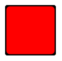
The following example shows the effects of some of the common properties on a Rectangle item, which in this case is used to create a square:
import QtQuick
Rectangle {
    width: 100
    height: 100
    color: "red"
    border.color: "black"
    border.width: 5
    radius: 10
}
使用 Item::antialiasing property improves the appearance of a rounded rectangle at the cost of rendering performance. You should consider unsetting this property for rectangles in motion, and only set it when they are stationary.
另請參閱 圖像 .
|
抗鋸齒 : bool |
Used to decide if the Rectangle should use antialiasing or not. 抗鋸齒 provides information on the performance implications of this property.
The default is true for Rectangles with a radius, and false otherwise.
|
邊框組 |
|---|
|
border.color : color |
|
border.pixelAligned : bool |
|
border.width : int |
The width and color used to draw the border of the rectangle.
A width of 1 creates a thin line. For no line, use a width of 0 or a transparent color.
注意: The width of the rectangle's border does not affect the geometry of the rectangle itself or its position relative to other items if anchors are used.
The border is rendered within the rectangle's boundaries.
若
pixelAligned
is
true
(the default), the rendered border width is rounded to a whole number of pixels, after device pixel ratio scaling. Setting
pixelAligned
to
false
will allow fractional border widths, which may be desirable when
antialiasing
被啓用。
|
bottomLeftRadius
:
real
|
This property holds the radius used to draw the bottom left corner.
若 bottomLeftRadius 未設置, radius will be used instead. If bottomLeftRadius is zero, the corner will be sharp.
注意: This API is considered tech preview and may change or be removed in future versions of Qt.
該特性在 Qt 6.7 引入。
另請參閱 radius , topLeftRadius , topRightRadius ,和 bottomRightRadius .
|
bottomRightRadius
:
real
|
This property holds the radius used to draw the bottom right corner.
若 bottomRightRadius 未設置, radius will be used instead. If bottomRightRadius is zero, the corner will be sharp.
注意: This API is considered tech preview and may change or be removed in future versions of Qt.
該特性在 Qt 6.7 引入。
另請參閱 radius , topLeftRadius , topRightRadius ,和 bottomLeftRadius .
|
color : color |
This property holds the color used to fill the rectangle.
默認顔色為白色。
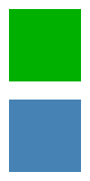
The following example shows rectangles with colors specified using hexadecimal and named color notation:
Rectangle {
    color: "#00B000"
    width: 80; height: 80
}
Rectangle {
    color: "steelblue"
    y: 100; width: 80; height: 80
}
If both a gradient and a color are specified, the gradient will be used.
另請參閱 gradient .
|
gradient : var |
用於填充矩形的漸變。
This property allows for the construction of simple vertical or horizontal gradients. Other gradients may be formed by adding rotation to the rectangle.
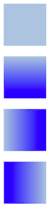
Rectangle {
    width: 80; height: 80
    color: "lightsteelblue"
}
Rectangle {
    width: 80; height: 80
    gradient: Gradient {
        GradientStop { position: 0.0; color: "lightsteelblue" }
        GradientStop { position: 1.0; color: "blue" }
    }
}
Rectangle {
    width: 80; height: 80
    gradient: Gradient {
        orientation: Gradient.Horizontal
        GradientStop { position: 0.0; color: "lightsteelblue" }
        GradientStop { position: 1.0; color: "blue" }
    }
}
Rectangle {
    width: 80; height: 80
    rotation: 90
    gradient: Gradient {
        GradientStop { position: 0.0; color: "lightsteelblue" }
        GradientStop { position: 1.0; color: "blue" }
    }
}
The property also accepts gradient presets from QGradient::Preset . Note however that due to Rectangle only supporting simple vertical or horizontal gradients, any preset with an unsupported angle will revert to the closest representation.
Rectangle {
    width: 80; height: 80
    gradient: Gradient.NightFade
}
Rectangle {
    width: 80; height: 80
    gradient: "SunnyMorning"
}
If both a gradient and a color are specified, the gradient will be used.
|
radius : real |
This property holds the corner radius used to draw a rounded rectangle.
If radius is non-zero, the rectangle will be painted as a rounded rectangle, otherwise it will be painted as a normal rectangle. Individual corner radii can be set as well (see below). These values will override radius. If they are unset (by setting them to
undefined
), radius will be used instead.
另請參閱 topLeftRadius , topRightRadius , bottomLeftRadius ,和 bottomRightRadius .
|
topLeftRadius
:
real
|
This property holds the radius used to draw the top left corner.
若 topLeftRadius 未設置, radius will be used instead. If topLeftRadius is zero, the corner will be sharp.
注意: This API is considered tech preview and may change or be removed in future versions of Qt.
該特性在 Qt 6.7 引入。
另請參閱 radius , topRightRadius , bottomLeftRadius ,和 bottomRightRadius .
|
topRightRadius
:
real
|
This property holds the radius used to draw the top right corner.
若 topRightRadius 未設置, radius will be used instead. If topRightRadius is zero, the corner will be sharp.
注意: This API is considered tech preview and may change or be removed in future versions of Qt.
該特性在 Qt 6.7 引入。
另請參閱 radius , topLeftRadius , bottomLeftRadius ,和 bottomRightRadius .