Push-button that can be clicked to perform a command or answer a question. 更多...
| 导入语句: | import QtQuick.Controls |
| 继承: | |
| 继承者: |
Button presents a push-button control that can be pushed or clicked by the user. Buttons are normally used to perform an action, or to answer a question. Typical buttons are OK , Apply , Cancel , Close , Yes , No ,和 Help .
Button inherits its API from AbstractButton . For instance, you can set text , display an icon , and react to clicks 使用 AbstractButton API.
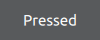
A button emits the signal clicked () when it is activated by the user. Connect to this signal to perform the button's action. Buttons also provide the signals canceled (), doubleClicked (), pressed (), released () 和 pressAndHold () for long presses.
See the snippet below on how to connect to the button's signals.
RowLayout {
    Button {
        text: "Ok"
        onClicked: model.submit()
    }
    Button {
        text: "Cancel"
        onClicked: model.revert()
    }
}
另请参阅 Customizing Button and 按钮控件 .
|
flat : bool |
This property holds whether the button is flat.
A flat button typically does not draw a background unless it is pressed or checked.
默认值为
false
.
|
highlighted : bool |
This property holds whether the button is highlighted.
A button can be highlighted in order to draw the user's attention towards it. It has no effect on keyboard interaction.
默认值为
false
.