Check button that can be toggled on or off. 更多...
| import 语句: | import QtQuick.Controls |
| 继承: | AbstractButton |
CheckBox presents an option button that can be toggled on (checked) or off (unchecked). Check boxes are typically used to select one or more options from a set of options. For larger sets of options, such as those in a list, consider using CheckDelegate 代替。
CheckBox inherits its API from AbstractButton . For instance, the state of the checkbox can be set with the checked 特性。
In addition to the checked and unchecked states, there is a third state: partially checked. The partially checked state can be enabled using the tristate property. This state indicates that the regular checked/unchecked state can not be determined; generally because of other states that affect the checkbox. This state is useful when several child nodes are selected in a treeview, for example.
ColumnLayout {
    CheckBox {
        checked: true
        text: qsTr("First")
    }
    CheckBox {
        text: qsTr("Second")
    }
    CheckBox {
        checked: true
        text: qsTr("Third")
    }
}
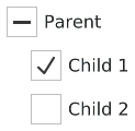
Hierarchical checkbox groups can be managed with a non-exclusive ButtonGroup .

The following example illustrates how the combined check state of children can be bound to the check state of the parent checkbox:
Column {
    ButtonGroup {
        id: childGroup
        exclusive: false
        checkState: parentBox.checkState
    }
    CheckBox {
        id: parentBox
        text: qsTr("Parent")
        checkState: childGroup.checkState
    }
    CheckBox {
        checked: true
        text: qsTr("Child 1")
        leftPadding: indicator.width
        ButtonGroup.group: childGroup
    }
    CheckBox {
        text: qsTr("Child 2")
        leftPadding: indicator.width
        ButtonGroup.group: childGroup
    }
}
另请参阅 Customizing CheckBox , ButtonGroup ,和 按钮控件 .
|
checkState : enumeration |
This property holds the check state of the checkbox.
Available states:
| 常量 | 描述 |
|---|---|
Qt.Unchecked
|
The checkbox is unchecked. |
Qt.PartiallyChecked
|
The checkbox is partially checked. This state is only used when tristate 被启用。 |
Qt.Checked
|
The checkbox is checked. |
|
[since QtQuick.Controls 2.4 (Qt 5.11)] nextCheckState : function |
This property holds a callback function that is called to determine the next check state whenever the checkbox is interactively toggled by the user via touch, mouse, or keyboard.
By default, a normal checkbox cycles between
Qt.Unchecked
and
Qt.Checked
states, and a tri-state checkbox cycles between
Qt.Unchecked
,
Qt.PartiallyChecked
,和
Qt.Checked
状态。
The
nextCheckState
callback function can override the default behavior. The following example implements a tri-state checkbox that can present a partially checked state depending on external conditions, but never cycles to the partially checked state when interactively toggled by the user.
CheckBox {
    tristate: true
    checkState: allChildrenChecked ? Qt.Checked :
                   anyChildChecked ? Qt.PartiallyChecked : Qt.Unchecked
    nextCheckState: function() {
        if (checkState === Qt.Checked)
            return Qt.Unchecked
        else
            return Qt.Checked
    }
}
This property was introduced in QtQuick.Controls 2.4 (Qt 5.11).
|
tristate : bool |
This property holds whether the checkbox is a tri-state checkbox.
In the animation below, the first checkbox is tri-state:
默认为
false
, i.e., the checkbox has only two states.