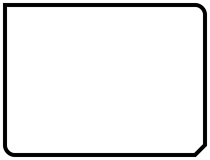
A filled rectangle with an optional border. 更多...
| import 語句: |
import QtQuick.Shapes.DesignHelpers 6.10
|
| Since: | QtQuick 6.10 |
RectangleShape is used to fill areas with solid color or gradients and to provide a rectangular border.
Each Rectangle item is painted using either a solid fill color, specified using the fillColor property, or a gradient, defined using one of the ShapeGradient subtypes and set using the gradient property. If both a color and a gradient are specified, the gradient is used.
An optional border can be added to a rectangle with its own color and thickness by setting the
strokeColor
and
strokeWidth
properties. Setting the color to
transparent
creates a border without a fill color.
Rounded rectangles can be drawn using the radius property. The radius can also be specified separately for each corner. Additionally, bevel can be applied on any corner to cut it off sharply.
RectangleShape's default value for
QtQuick.Shapes::Shape::preferredRendererType
is
Shape.CurveRenderer
.
    RectangleShape {
        id: rectangleShape
        anchors.centerIn: parent
        radius: 0
        topLeftRadius: 30
        bottomRightRadius: 30
        bevel: true
        joinStyle: ShapePath.MiterJoin
        fillColor: "#3ad23c"
        strokeColor: "transparent"
        visible: false
    }

|
bottomLeftRadius : real |
|
bottomRightRadius : real |
|
topLeftRadius : real |
|
topRightRadius : real |
If set, these properties define the individual corner radii. A zero value defines that corner to be sharp, while a positive value defines it to be rounded. When unset, the value of radius 被使用,取而代之。
These properties are unset by default. Assign
undefined
to them to return them to the unset state.
在以下範例中,
radius
被設為
10
,和
topLeftRadius
to
0
:
    RectangleShape {
        id: rectangleShape
        anchors.centerIn: parent
        topLeftRadius: 0
        bottomRightBevel: true
        joinStyle: ShapePath.MiterJoin
    }

另請參閱 radius .
|
bottomLeftBevel : bool |
|
bottomRightBevel : bool |
|
topLeftBevel : bool |
|
topRightBevel : bool |
If set, these properties define the individual corner bevels. Setting them to
false
results in either sharp or rounded corners, depending on the values of the individual
radius
properties. Setting them to
true
results in bevelled corners. When unset, the value of
bevel
被使用,取而代之。
These properties are unset by default. Assign
undefined
to them to return them to the unset state.
在以下範例中,
bottomRightBevel
is set to true:
    RectangleShape {
        id: rectangleShape
        anchors.centerIn: parent
        topLeftRadius: 0
        bottomRightBevel: true
        joinStyle: ShapePath.MiterJoin
    }

另請參閱 bevel .
|
bevel : bool |
This property defines whether the corners of the rectangle are beveled.
把它設為
false
results in either sharp or rounded corners, depending on the values of the individual
radius
特性。
This property may be overridden by the individual bevel properties.
    RectangleShape {
        id: rectangleShape
        anchors.centerIn: parent
        radius: 0
        topLeftRadius: 30
        bottomRightRadius: 30
        bevel: true
        joinStyle: ShapePath.MiterJoin
        fillColor: "#3ad23c"
        strokeColor: "transparent"
        visible: false
    }

另請參閱 topLeftBevel , topRightBevel , bottomLeftBevel ,和 bottomRightBevel .
|
borderMode : enumeration |
The borderMode property determines where the border is drawn along the edge of the rectangle.
| 常量 | 描述 |
|---|---|
RectangleShape.Inside
|
The border is drawn along the inside edge of the item and does not affect the item width. |
This is the default value.
| 常量 | 描述 |
|---|---|
RectangleShape.Middle
|
The border is drawn over the edge of the item and does not affect the item width. |
RectangleShape.Outside
|
The border is drawn along the outside edge of the item and increases the item width by the value of strokeWidth . |
另請參閱 strokeWidth .
|
capStyle : enumeration |
This property defines how the end points of lines are drawn. The default value is
ShapePath.SquareCap
.
| 常量 | 描述 |
|---|---|
ShapePath.FlatCap
|
A square line end that does not cover the end point of the line. |
ShapePath.SquareCap
|
A square line end that covers the end point and extends beyond it by half the line width. |
ShapePath.RoundCap
|
A rounded line end. |
|
dashOffset : real |
This property defines the starting point on the dash pattern, measured in units used to specify the dash pattern.
默認值為
0
.
另請參閱 QPen::setDashOffset ().
This property defines the dash pattern when strokeStyle 被設為 ShapePath .DashLine. The pattern must be specified as an even number of positive entries where the entries 1, 3, 5... are the dashes and 2, 4, 6... are the spaces. The pattern is specified in units of the pen's width.
The default value is (4, 2), meaning a dash of 4 * strokeWidth pixels followed by a space of 2 * strokeWidth 像素。
另請參閱 QPen::setDashPattern ().
|
fillColor : color |
This property holds the fill color.
當設為
transparent
, no filling occurs.
默認值為
"white"
.
注意:
若
fillGradient
is set to something other than
null
, it will be used instead of
fillColor
.
|
fillGradient : ShapeGradient |
The fillGradient of the rectangle fill color.
By default, no fillGradient is enabled and the value is null. In this case, the fill uses a solid color based on the value of fillColor .
When set, fillColor is ignored and filling is done using one of the ShapeGradient subtypes.
注意: The 漸變 type cannot be used here. Rather, prefer using one of the advanced subtypes, like LinearGradient .
|
fillRule : enumeration |
This property holds the fill rule. The default value is
ShapePath.OddEvenFill
. For an explanation on fill rules, see
QPainterPath::setFillRule
().
| 常量 | 描述 |
|---|---|
ShapePath.OddEvenFill
|
Odd-even fill rule. |
ShapePath.WindingFill
|
Non-zero winding fill rule. |
|
joinStyle : enumeration |
This property defines how joins between two connected lines are drawn. The default value is
ShapePath.BevelJoin
.
| 常量 | 描述 |
|---|---|
ShapePath.MiterJoin
|
綫外部邊緣按角度延伸相交,並填充此區域。 |
ShapePath.BevelJoin
|
填充 2 綫條之間的三角形凹槽。 |
ShapePath.RoundJoin
|
填充 2 條綫之間的弧形。 |
|
radius : real |
This property defines the corner radius used to define a rounded rectangle.
If radius is a positive value, the rectangle path will be defined as a rounded rectangle, otherwise it will be defined as a normal rectangle.
This property may be overridden by the individual corner radius properties.
默認值為
10
.
另請參閱 topLeftRadius , topRightRadius , bottomLeftRadius ,和 bottomRightRadius .
|
strokeColor : color |
This property holds the stroking color.
當設為
transparent
, no stroking occurs.
默認值為
"black"
.
|
strokeStyle : enumeration |
This property defines the style of stroking. The default value is ShapePath .SolidLine.
| 常量 | 描述 |
|---|---|
ShapePath.SolidLine
|
純綫條。 |
ShapePath.DashLine
|
由幾像素分隔的虛綫。 |
|
strokeWidth : real |
This property holds the stroke width.
When set to a negative value, no stroking occurs.
默認值為
1
.