Defines a rectangle with optionally rounded corners. 更多...
| import 語句: |
import QtQuick
|
| Since: | QtQuick 6.8 |
(從 6.10 起)
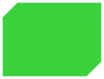
PathRectangle provides an easy way to specify a rectangle, optionally with rounded or beveled corners. The API corresponds to that of the Rectangle 項。

    Shape {
        id: rectangleShape
        width: 200
        height: 150
        anchors.centerIn: parent
        preferredRendererType: Shape.CurveRenderer
        ShapePath {
            fillColor: "#3ad23c"
            PathRectangle {
                width: rectangleShape.width
                height: rectangleShape.height
                topLeftRadius: 30
                bottomRightRadius: 30
                bevel: true
            }
        }
    }
另請參閱 路徑 , PathLine , PathQuad , PathCubic , PathArc , PathAngleArc , PathCurve ,和 PathSvg .
|
x : real |
|
y : real |
Defines the top left corner of the rectangle.
Unless that corner is rounded, this will also be the start and end point of the path.
另請參閱 relativeX and relativeY .
|
relativeX : real |
|
relativeY : real |
Defines the top left corner of the rectangle relative to the path's start point.
If both a relative and absolute end position are specified for a single axis, the relative position will be used.
Relative and absolute positions can be mixed, for example it is valid to set a relative x and an absolute y.
|
height : real |
|
width : real |
Defines the width and height of the rectangle.
|
bottomLeftRadius : real |
|
bottomRightRadius : real |
|
topLeftRadius : real |
|
topRightRadius : real |
If set, these properties define the individual corner radii. A zero value defines that corner to be sharp, while a positive value defines it to be rounded. When unset, the value of radius 被使用,取而代之。
These properties are unset by default. Assign
undefined
to them to return them to the unset state.
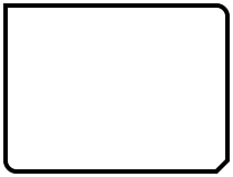
在以下範例中,
radius
被設為
10
,和
topLeftRadius
to
0
:
    Shape {
        id: rectangleShape
        width: 200
        height: 150
        anchors.centerIn: parent
        preferredRendererType: Shape.CurveRenderer
        ShapePath {
            strokeColor: "black"
            strokeWidth: 4
            joinStyle: ShapePath.MiterJoin
            PathRectangle {
                width: rectangleShape.width
                height: rectangleShape.height
                radius: 10
                topLeftRadius: 0
                bottomRightBevel: true
            }
        }
    }

另請參閱 radius .
|
bottomLeftBevel : bool |
|
bottomRightBevel : bool |
|
topLeftBevel : bool |
|
topRightBevel : bool |
If set, these properties define the individual corner bevels. Setting them to
false
results in either sharp or rounded corners, depending on the values of the individual
radius
properties. Setting them to
true
results in bevelled corners. When unset, the value of
bevel
被使用,取而代之。
These properties are unset by default. Assign
undefined
to them to return them to the unset state.
在以下範例中,
bottomRightBevel
is set to true:
    Shape {
        id: rectangleShape
        width: 200
        height: 150
        anchors.centerIn: parent
        preferredRendererType: Shape.CurveRenderer
        ShapePath {
            strokeColor: "black"
            strokeWidth: 4
            joinStyle: ShapePath.MiterJoin
            PathRectangle {
                width: rectangleShape.width
                height: rectangleShape.height
                radius: 10
                topLeftRadius: 0
                bottomRightBevel: true
            }
        }
    }

另請參閱 bevel .
|
bevel
:
bool
|
This property defines whether the corners of the rectangle are beveled.
把它設為
false
results in either sharp or rounded corners, depending on the values of the individual
radius
特性。
This property may be overridden by the individual bevel properties.
    Shape {
        id: rectangleShape
        width: 200
        height: 150
        anchors.centerIn: parent
        preferredRendererType: Shape.CurveRenderer
        ShapePath {
            fillColor: "#3ad23c"
            PathRectangle {
                width: rectangleShape.width
                height: rectangleShape.height
                topLeftRadius: 30
                bottomRightRadius: 30
                bevel: true
            }
        }
    }

此特性在 Qt 6.10 引入。
另請參閱 topLeftBevel , topRightBevel , bottomLeftBevel ,和 bottomRightBevel .
|
radius : real |
This property defines the corner radius used to define a rounded rectangle.
If radius is a positive value, the rectangle path will be defined as a rounded rectangle, otherwise it will be defined as a normal rectangle.
This property may be overridden by the individual corner radius properties.
默認值為
0
.
另請參閱 topLeftRadius , topRightRadius , bottomLeftRadius ,和 bottomRightRadius .
|
strokeAdjustment : real |
This property defines the stroke width adjustment to the rectangle coordinates.
When used in a ShapePath with stroking enabled, the actual stroked rectangle will by default extend beyond the defined rectangle by half the stroke width on all sides. This is the expected behavior since the path defines the midpoint line of the stroking, and corresponds to QPainter and SVG rendering.
If one instead wants the defined rectangle to be the outer edge of the stroked rectangle, like a Rectangle item with a border, one can set strokeAdjustment to the stroke width. This will effectively shift all edges inwards by half the stroke width. Like in the following example:
ShapePath {
    id: myRec
    fillColor: "white"
    strokeColor: "black"
    strokeWidth: 16
    joinStyle: ShapePath.MiterJoin
    PathRectangle { x: 10; y: 10; width: 200; height: 100; strokeAdjustment: myRec.strokeWidth }
}