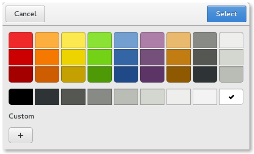
A color dialog. 更多...
| import 語句: |
import QtQuick.Dialogs
|
| Since: | Qt 6.4 |
| 繼承: |
The ColorDialog type provides a QML API for color dialogs.
To show a color dialog, construct an instance of ColorDialog, set the desired properties, and call open ()。 selectedColor property can be used to determine the initially selected color in the dialog.
MenuItem {
    text: qsTr("Color")
    onTriggered: colorDialog.open()
}
ColorDialog {
    id: colorDialog
    selectedColor: document.color
    onAccepted: document.color = selectedColor
}
MyDocument {
    id: document
}
A native platform color dialog is currently available on the following platforms:
Qt Quick Dialogs uses a Qt Quick implementation as a fallback on platforms that do not have a native implementation available.
|
options : flags |
This property holds the various options that affect the look and feel of the dialog.
默認情況下,所有選項是被禁用的。
Options should be set before showing the dialog. Setting them while the dialog is visible is not guaranteed to have an immediate effect on the dialog (depending on the option and on the platform).
Available options:
| 常量 | 描述 |
|---|---|
ColorDialog.ShowAlphaChannel
|
Show a slider and additional input fields for the alpha value. |
ColorDialog.NoButtons
|
不顯示 打開 and Cancel buttons (useful for "live dialogs"). |
ColorDialog.NoEyeDropperButton
|
不顯示 Eye Dropper button. This value was added in Qt 6.6. |
ColorDialog.DontUseNativeDialog
|
Forces the dialog to use a non-native quick implementation. |
|
selectedColor : color |
This property holds the currently selected color in the dialog.
The accepted () signal can be handled to get the final selection. When the user has clicked 打開 to accept a color, a signal handler for the accepted () signal can query the selectedColor property to get the final color that was selected by the user.
另請參閱 accepted ().