A grid of days for a calendar month. 更多...
| import 語句: |
import QtQuick.Controls
|
| 繼承: |
MonthGrid presents a calendar month in a grid. The contents are calculated for a given month and year ,使用指定 locale .
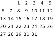
MonthGrid {
    month: Calendar.December
    year: 2015
    locale: Qt.locale("en_US")
}
MonthGrid can be used as a standalone control, but it is most often used in conjunction with DayOfWeekRow and WeekNumberColumn . Regardless of the use case, positioning of the grid is left to the user.
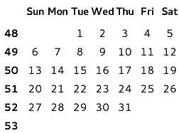
GridLayout {
    columns: 2
    DayOfWeekRow {
        locale: grid.locale
        Layout.column: 1
        Layout.fillWidth: true
    }
    WeekNumberColumn {
        month: grid.month
        year: grid.year
        locale: grid.locale
        Layout.fillHeight: true
    }
    MonthGrid {
        id: grid
        month: Calendar.December
        year: 2015
        locale: Qt.locale("en_US")
        Layout.fillWidth: true
        Layout.fillHeight: true
    }
}
The visual appearance of MonthGrid can be changed by implementing a custom delegate .
When viewing any given month, MonthGrid shows days from the previous and next month. This means it always shows six rows, even when first or last row is entirely within an adjacent month.
To localize days, use Locale.toString (). For example, to display day numbers in an Arabic locale:
MonthGrid {
    id: monthGrid
    month: Calendar.December
    year: 2015
    locale: Qt.locale("ar")
    delegate: Text {
        horizontalAlignment: Text.AlignHCenter
        verticalAlignment: Text.AlignVCenter
        opacity: model.month === monthGrid.month ? 1 : 0
        text: monthGrid.locale.toString(model.date, "d")
        font: monthGrid.font
        required property var model
    }
}
另請參閱 DayOfWeekRow , WeekNumberColumn , CalendarModel ,和 Qt Quick Controls - Event Calendar .
|
delegate : Component |
This property holds the item delegate that visualizes each day.
除瞭
index
property, a list of model data roles are available in the context of each delegate:
| model.date : date | The date of the cell |
| model.day : int | The number of the day |
| model.today : bool | Whether the delegate represents today |
| model.weekNumber : int | The week number |
| model.month : int | The number of the month |
| model.year : int | The number of the year |
The following snippet presents the default implementation of the item delegate. It can be used as a starting point for implementing custom delegates.
delegate: Text {
    horizontalAlignment: Text.AlignHCenter
    verticalAlignment: Text.AlignVCenter
    opacity: model.month === control.month ? 1 : 0
    text: model.day
    font: control.font
    color: control.palette.text
    required property var model
}
|
month : int |
This property holds the number of the month. The default value is the current month.
Calendar-related types in Qt Quick Controls use 0-based month numbers, like the JavaScript Date objects. However, this differs from QDate , where the months are numbered starting from 1.
To avoid confusion, you can use the following enumeration values:
| 常量 | 描述 |
|---|---|
Calendar.January
|
January (0) |
Calendar.February
|
February (1) |
Calendar.March
|
March (2) |
Calendar.April
|
April (3) |
Calendar.May
|
May (4) |
Calendar.June
|
June (5) |
Calendar.July
|
July (6) |
Calendar.August
|
August (7) |
Calendar.September
|
September (8) |
Calendar.October
|
October (9) |
Calendar.November
|
November (10) |
Calendar.December
|
December (11) |
另請參閱 Calendar .
|
title : string |
This property holds a title for the calendar.
This property is provided for convenience. MonthGrid itself does not visualize the title. The default value consists of the month name, formatted using locale , and the year number.
|
year : int |
This property holds the number of the year.
The value must be in the range from
-271820
to
275759
. The default value is the current year.
|
clicked ( date date ) |
此信號發射,當 date 被點擊。
注意:
相應處理程序是
onClicked
.
|
pressAndHold ( date date ) |
此信號發射,當 date is pressed and held down.
注意:
相應處理程序是
onPressAndHold
.
|
pressed ( date date ) |
此信號發射,當 date is pressed.
注意:
相應處理程序是
onPressed
.
|
released ( date date ) |
此信號發射,當 date 被釋放。
注意:
相應處理程序是
onReleased
.