Using Graphs for 2D in a Qt Quick application.
HelloGraphs shows how to make a simple 2D bar graph and line graph.
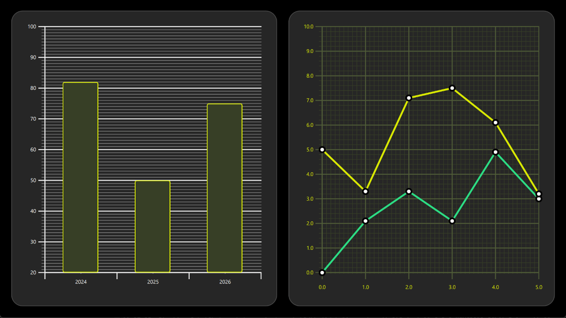
The following sections describe how to create a bar graph using BarSeries and a line graph using LineSeries .
要运行范例从 Qt Creator ,打开 欢迎 模式,然后选择范例从 范例 。更多信息,见 Qt Creator:教程:构建并运行 .
The first graph in the example is a bar graph. Creating it starts with a
GraphsView
component, setting the
X axis
,
Y axis
and
theme
. X axis is a
BarCategoryAxis
with 3 categories. Both the vertical grid and the axis lines are hidden. Y axis is a
ValueAxis
with visible range between 20 and 100. Major ticks with labels will be shown on every 10 values using
tickInterval
. Subticks will be shown on every 1 values using
subTickCount
9
, which means that between every major tick there will be 9 minor ones. Lastly,
theme
is added to one which is suitable on dark backgrounds. This theme adjusts the graph background grid, axis lines and labels.
GraphsView {
    anchors.fill: parent
    anchors.margins: 16
    axisX: BarCategoryAxis {
        categories: [2024, 2025, 2026]
        gridVisible: false
        subGridVisible: false
    }
    axisY: ValueAxis {
        min: 20
        max: 100
        tickInterval: 10
        subTickCount: 9
    }
    theme: GraphsTheme {
        colorScheme: GraphsTheme.ColorScheme.Dark
        theme: GraphsTheme.Theme.QtGreen
    }
    ...
To make this a bar graph, add a BarSeries .
BarSeries {
    ...
Then data is added into BarSeries 使用 BarSet . There are 3 bars with defined custom bars color and border properties. These properties will override the possible seriesColors set for the GraphsTheme .
BarSet {
    values: [82, 50, 75]
    borderWidth: 2
    color: "#373F26"
    borderColor: "#DBEB00"
}
The second graph of the example is a line graph. It also starts by defining a GraphsView element. Custom GraphsTheme is created to get a custom appearance. GraphsTheme offers quite a wide range of customization possibilities for the background grid and axis, which get applied after the theme .
The GraphsView 定义 axisX and axisY suitable for this graph.
GraphsView {
    anchors.fill: parent
    anchors.margins: 16
    theme: GraphsTheme {
        readonly property color c1: "#DBEB00"
        readonly property color c2: "#373F26"
        readonly property color c3: Qt.lighter(c2, 1.5)
        colorScheme: GraphsTheme.ColorScheme.Dark
        seriesColors: ["#2CDE85", "#DBEB00"]
        grid.mainColor: c3
        grid.subColor: c2
        axisX.mainColor: c3
        axisY.mainColor: c3
        axisX.subColor: c2
        axisY.subColor: c2
        axisX.labelTextColor: c1
        axisY.labelTextColor: c1
    }
    axisX: ValueAxis {
        max: 5
        tickInterval: 1
        subTickCount: 9
        labelDecimals: 1
    }
    axisY: ValueAxis {
        max: 10
        tickInterval: 1
        subTickCount: 4
        labelDecimals: 1
    }
    ...
自定义
Delegate
component is used to visualize the data points.
component Marker : Rectangle {
    width: 16
    height: 16
    color: "#ffffff"
    radius: width * 0.5
    border.width: 4
    border.color: "#000000"
}
To make this a line graph, add a
LineSeries
. This sets the
pointDelegate
to use the custom
Delegate
component that was created earlier. Data points are added using
XYPoint
元素。
LineSeries {
    id: lineSeries1
    width: 4
    pointDelegate: Marker { }
    XYPoint { x: 0; y: 0 }
    XYPoint { x: 1; y: 2.1 }
    XYPoint { x: 2; y: 3.3 }
    XYPoint { x: 3; y: 2.1 }
    XYPoint { x: 4; y: 4.9 }
    XYPoint { x: 5; y: 3.0 }
}
The second line series is similar to the first. As this is second
LineSeries
在
GraphsView
, second color from the
seriesColors
gets automatically picked.
LineSeries {
    id: lineSeries2
    width: 4
    pointDelegate: Marker { }
    XYPoint { x: 0; y: 5.0 }
    XYPoint { x: 1; y: 3.3 }
    XYPoint { x: 2; y: 7.1 }
    XYPoint { x: 3; y: 7.5 }
    XYPoint { x: 4; y: 6.1 }
    XYPoint { x: 5; y: 3.2 }
}