具有基于状态的自定义用户界面的 Qt Quick 应用程序。
This app demonstrates a cross platform, multi screen size and responsive way of implementing a typical user interface for product ordering.
要运行范例从 Qt Creator ,打开 欢迎 模式,然后选择范例从 范例 。更多信息,见 Qt Creator:教程:构建并运行 .
This section guides you through the typical user flow for the application.
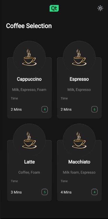
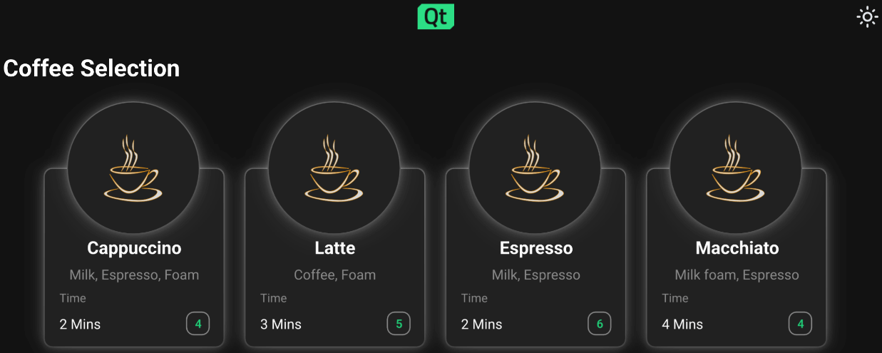
{List of available coffee types}
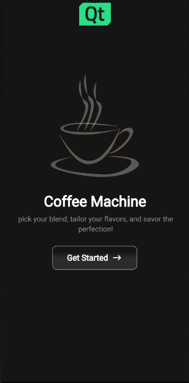
The coffee machine application lets you choose a type of coffee and indicates how many coffees of that type you have left to order.
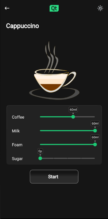
{Sliders to customise the ratio of the coffee blend}
Once a recipe is selected, the app displays what ratio the coffee blend will contain of:
This can be modified using sliders.
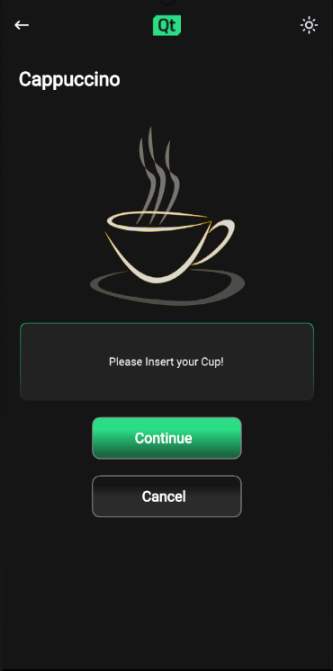
{Prompting user to insert a cup}
Once the user has acknowledged that the cup is in the machine, the brew starts.
When the brew has been started, the app shows an animated display of the brewing process.
Once the brewing process has ended, the app shows coffee cup with the desired coffee mix in it for a few seconds before returning to the starting page.
Here we discuss how these features are implemented.
The application window root object has initial values for height and width, which will be used as the window size on desktop platforms. The default QWindow::AutomaticVisibility ensures that the window will be shown as maximized or fullscreen on platforms that require it, such as mobile platforms.
ApplicationWindow {
    visible: true
    width: 1000
    height: 600
    title: qsTr("Coffee")
From there child objects of the
ApplicationWindow
fetch the size of the
ApplicationWindow
to determine their own sizes accordingly.
The app uses GridLayout throughout the application page components to easily adapt to changes in screen orientation.
{Landscape orientation of coffee machine selection page for Android}
{Screen switches to landscape when Android device orientation is landscape}
{Landscape orientation of coffee machine selection page for Windows}
{Landscape mode is the default orientation on Windows desktop}
注意: On the desktop version, the width must be greater than the height.
应用程序使用
StackView
QML type to display different pages of the app. The
StackView
handling the different page components is implemented in
ApplicationFlowForm.ui.qml
.
Navigating from one page to next triggers a state change in
ApplicationFlow.qml
where the needed property changes are handled by
PropertyChanges
QML type:
states: [
    State {
        name: "Home"
        PropertyChanges {
            target: toolbar
            backButton.opacity: 0
            backButton.enabled: false
            themeButton.opacity: 0
            themeButton.enabled: false
            logo.sourceSize.width: 70
            logo.sourceSize.height: 50
        }
The animations happening during these state changes are implemented with
Transition
and
PropertyAnimation
在
StackView
component in
ApplicationFLowForm.ui.qml
.
The application starts by showing the
Home
page to the user as the initial item in the
StackView
:
StackView {
    id: stack
    anchors.top: parent.top
    anchors.bottom: parent.bottom
    anchors.left: parent.left
    anchors.right: parent.right
    anchors.topMargin: parent.height / 20
    initialItem: Home {
        id: home
        visible: true
        state: applicationFlow.mode
    }
    pushEnter: Transition {
        PropertyAnimation {
            property: "x"
            from: stack.width
            to: 0
            duration: 400
        }
    }
The
Home
component is structured by placing
Item
component as the root object with state machine and appropriate property aliases, followed by
GridLayout
. This same kind of structuring will be used in all of the app page components.
The
Home
page displays an image of a coffee cup with Qt logo on top, Coffee Machine as a title, caption with some catchy briefing on what the user can expect and a
getStartedButton
按钮。
The user can move forward by pressing the
getStartedButton
, the button
onClicked
function is implemented
ApplicationFlow.qml
:
home.getStartedbutton.onClicked: {
    applicationFlow.state = "Coffee-selection"
    stack.push(choosingCoffee)
}
This will trigger the state change to "Coffee-selection" in
ApplicationFlow.qml
and push the
choosingCoffee
component on top of the
Home
component in
StackView
.
On the Coffee Selection page
ChoosingCoffee.qml
is displayed, here the user sees 4 different coffee options to choose from. These options are displayed as
CoffeeCards
which are located inside the
GridLayout
in
ChoosingCoffee.qml
:
GridLayout {
    id: cards
    anchors.horizontalCenter: parent.horizontalCenter
    anchors.top: parent.top
    rowSpacing: 20
    columnSpacing: 20
    CoffeeCard {
        id: cappuccino
        coffeeName: "Cappuccino"
        ingredients: "Milk, Espresso, Foam"
        time: 2
        cupsLeft: applicationFlow.cappuccinos
    }
    CoffeeCard {
        id: latte
        coffeeName: "Latte"
        ingredients: "Coffee, Foam"
        time: 3
        cupsLeft: applicationFlow.lattes
    }
    CoffeeCard {
        id: espresso
        coffeeName: "Espresso"
        ingredients: "Milk, Espresso"
        time: 2
        cupsLeft: applicationFlow.espressos
    }
    CoffeeCard {
        id: macchiato
        coffeeName: "Macchiato"
        ingredients: "Milk foam, Espresso"
        time: 4
        cupsLeft: applicationFlow.macchiatos
    }
}
实现为
CoffeeCard
is located
CoffeeCard.qml
.
These cards may be displayed in either grid or in a row type of way depending on the available screen width and height properties that the
ApplicationWindow
root object follows and passes down to the
ChoosingCoffee.qml
and to the
GridLayout
in there through the state machine.
CoffeeCards
vary in their names, brewing times, ingredients and how many cups there are available at the moment.
On this page the user can also change the application theme for the first time by pressing the little sun looking icon button from the upper right corner of the screen. Pressing the theme button calls
themeButton
函数在
ApplicationFlow.qml
:
function themeButton() {
    if (Colors.currentTheme == Colors.dark) {
        Colors.currentTheme = Colors.light
    } else {
        Colors.currentTheme = Colors.dark
    }
}
The function changes the
currentTheme
property of
Colors.qml
and colors change throughout the app by property bindings automatically. All the colors used in app are located in
Colors.qml
.
If theme is switched to light theme the theme changing icon button icon turns to represent a half moon.
Pressing on any of the coffee cards triggers a state change inside
AbstractButton
in
CoffeeCard.qml
which then triggers
NumberAnimation
透过
Transition
:
AbstractButton {
    width: parent.width - 2
    height: parent.height - 2
    anchors.horizontalCenter: parent.horizontalCenter
    anchors.verticalCenter: parent.verticalCenter
    id: button
    hoverEnabled: true
    checkable: true
    enabled: (cupsLeft != 0) ? true : false
    transitions: Transition {
        NumberAnimation {
            properties: "scale"
            duration: 50
            easing.type: Easing.InOutQuad
        }
    }
This will scale the selected coffee card down to smaller size and turns the edges of the card to green giving user the expression that the coffee was indeed selected.
Every coffee cards
button
property alias
onClicked
function binds to a function located in
ApplicationFlow.qml
. When user presses any of the coffee cards the function with a name correlating with the chosen coffee option gets called. The function will set the state of
ApplicationFlow.qml
to
Settings
, push a new component to the
StackView
and set the ingredient properties accordingly.
On this page the user can customize their coffee option to match their preference by adjusting custom
Slider
QML types. Changing the value of sliders will affect the liquid levels seen inside the coffee cup, this is made possible by binding the height of the liquid images inside
Cup.qml
to the values of corresponding sliders.
The values of the sliders will be stored to property variables in
ApplicationFLow.qml
透过
onValueChanged
函数。
coffeeSlider.onValueChanged: {
    applicationFlow.coffeeAmount = coffeeSlider.value
}
Clicking on Start button changes the state of
ApplicationFlow.qml
to "Insert", and the app displays the
Insert.qml
.
On this page the user is instructed to insert their cup on to the machine before the brewing process can start.
Pressing the
Continue
button will move app to
Progress
页面。
Progress page displays a coffee cup and progress bar that will both in their own way signal the brewing process in real time.
The coffee cup here once filled will display the exact same configuration as the user selected on
Settings
page, this is made sure by binding the
Cup
property variables to the saved corresponding values in
ApplicationFlow.qml
.
The animation for filling the coffee cup happens with state engines Transition and SmoothedAnimation .
Cup {
    id: cup
    Layout.alignment: Qt.AlignHCenter | Qt.AlignTop
    state: "0"
}
The progress bar animation is implemented with 行为 .
Behavior on greenBar.width {
    SmoothedAnimation {
        easing.type: Easing.Linear
        velocity: (contentItem.width / brewTime) * 1000
    }
}
Timer will take care of updating the application state once the brewing is done.
Timer {
    id: timer
    interval: brewTime
    running: true
    onTriggered: {
        applicationFlow.onFinished()
    }
}
Ready page displays a coffee cup filled with whatever configuration the user selected with a "Your coffee is ready" text and a check icon.
When this page is displayed a
Timer
starts running and once the interval set is reached user is directed back to
Home.qml
.
另请参阅 所有 Qt 范例 .